Challenge
Operating across multiple currencies and markets, requires constant visibility into balances, exposure, operational risk and FX performance. While the data and systems existed, the reporting experience was fragmented and difficult to navigate. Insights were spread across dashboards, spreadsheets, and static reports, resulting in insights being pieced together, which slowed down decision-making. As the platform had evolved, features were added gradually, resulting in a dashboard that lacked a clear user experience and functional structure.
My Role
I led the design of the internal management dashboard from early discovery through to delivery, shaping the information architecture, interaction patterns, and visual system. I worked closely with finance stakeholders and engineers to translate operational requirements into a clear, decision-focused product.
Quotes from user interviews


Key Insights


Hypothesis
Bringing fragmented performance and data into a clear, structured, at-a-glance dashboard would reduce reliance on manual reports and enable faster, more confident operational decisions.
The Discovery
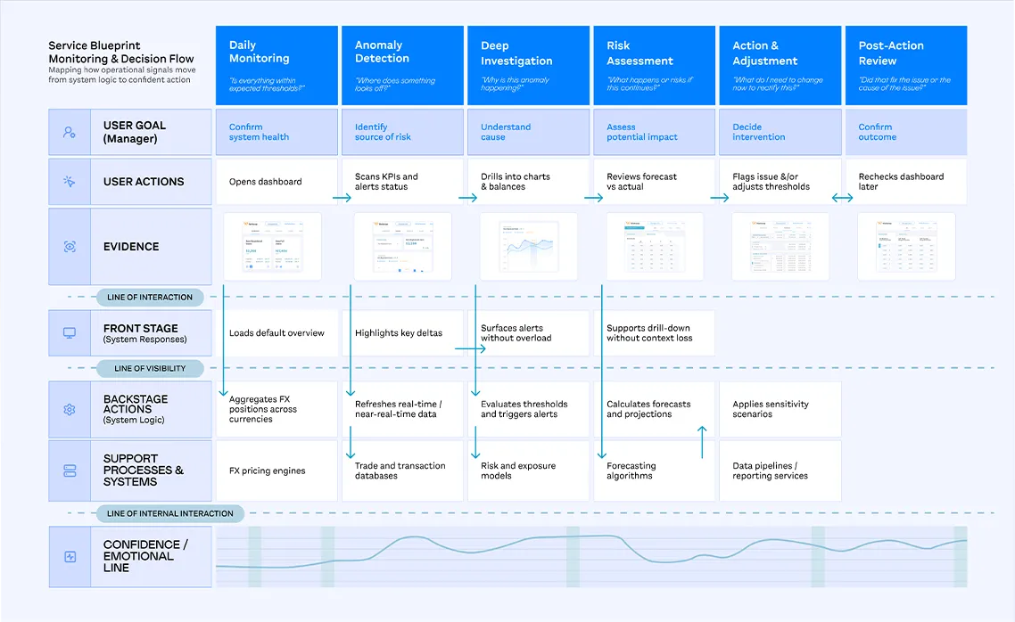
We mapped how teams monitored performance and moved to action, revealing where complexity and fragmentation slowed confident decision-making.
The Design
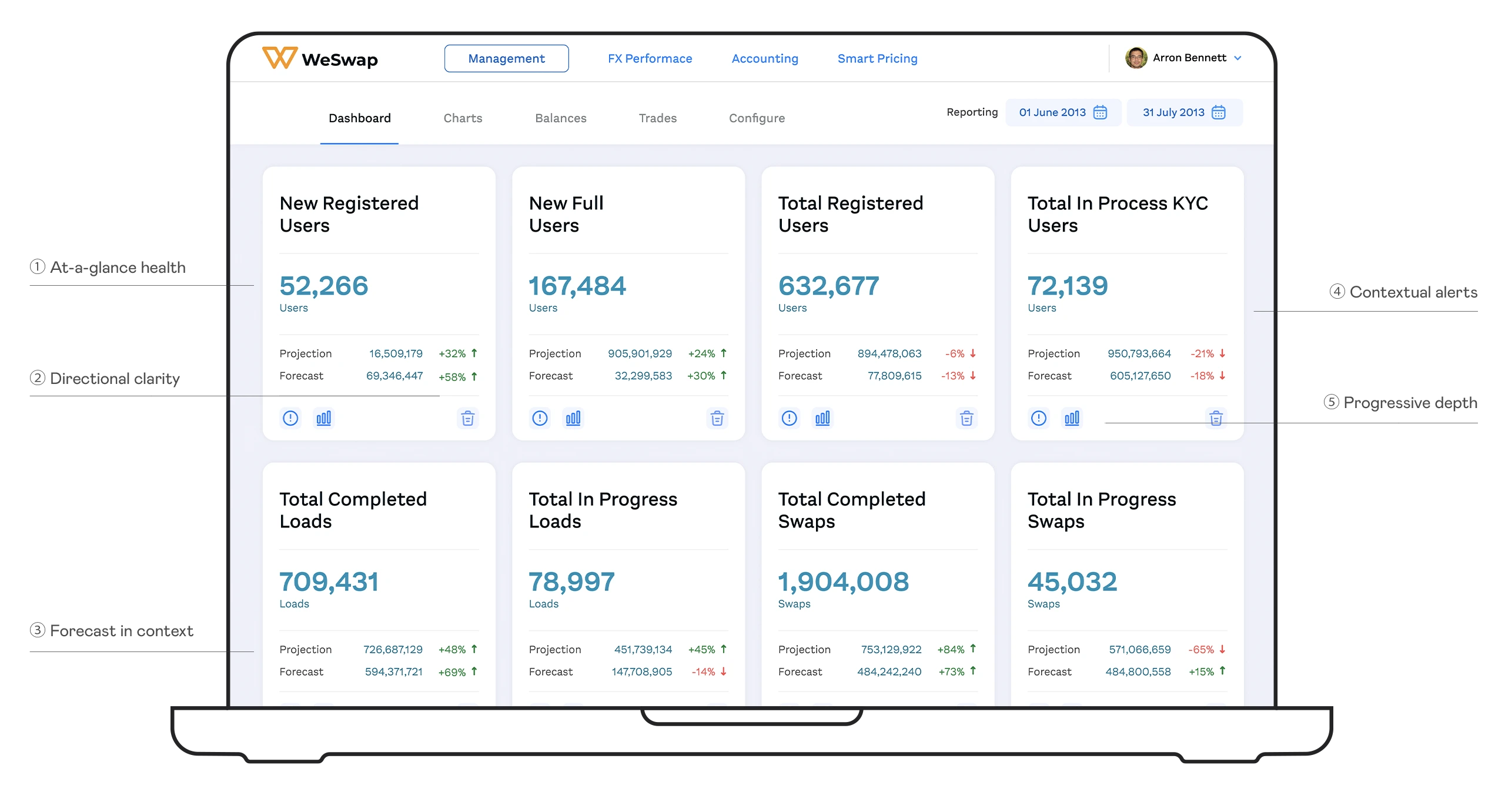
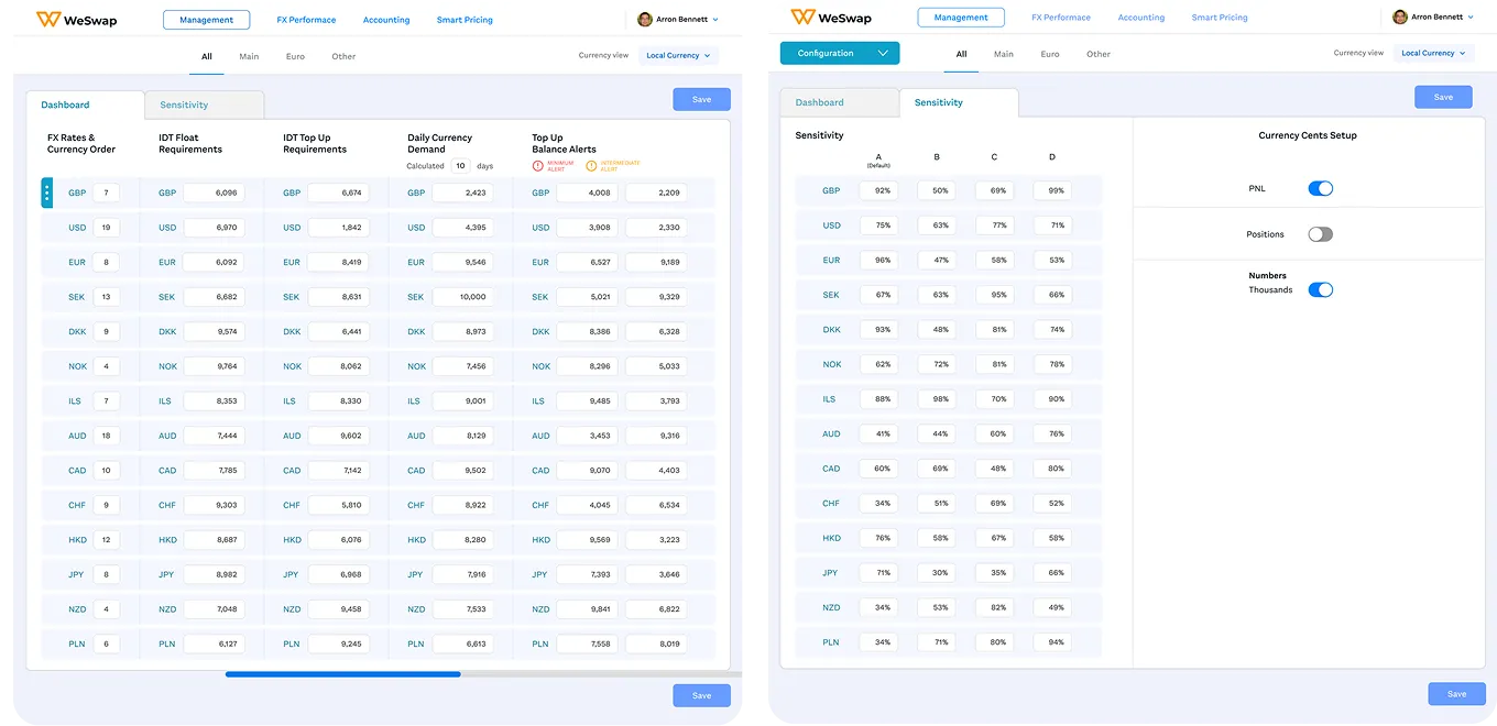
One dashboard needed to support multiple depths of use.
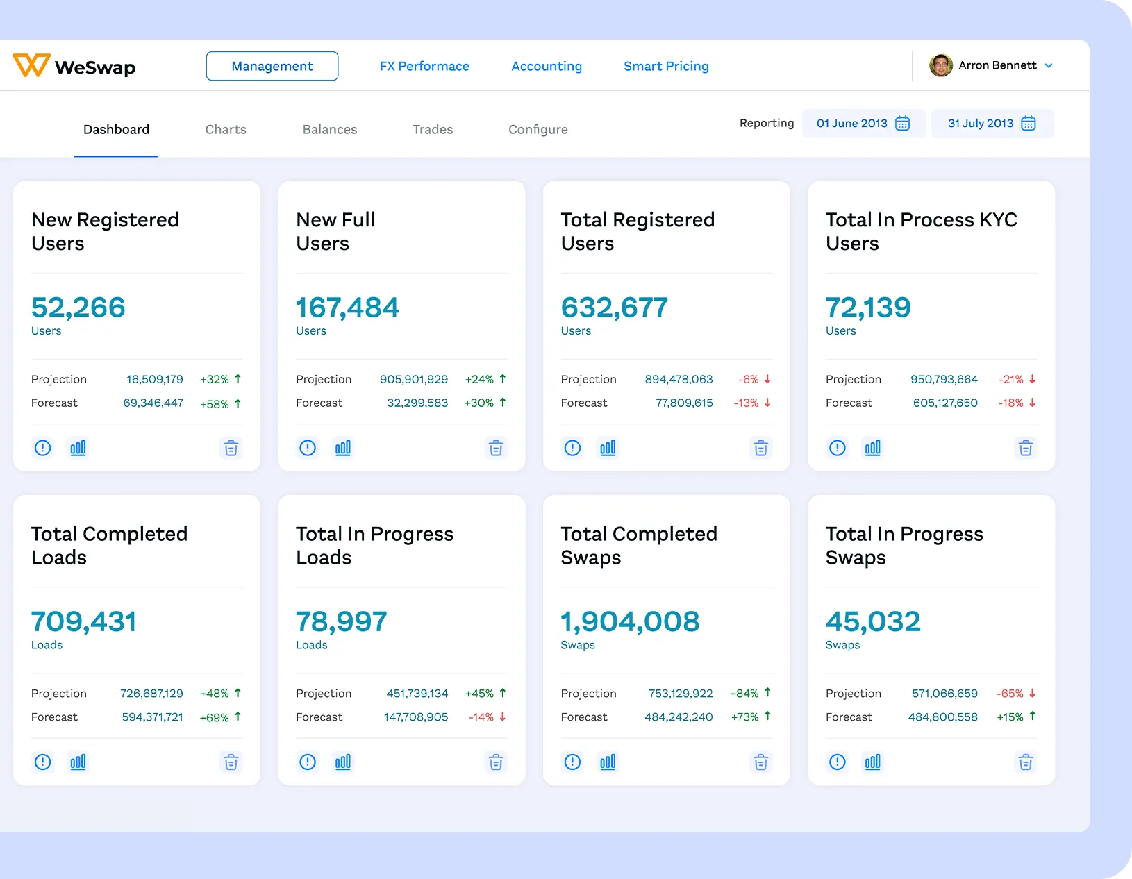
The primary dashboard was designed to provide a high-level, at-a-glance view of performance, allowing teams to quickly assess health before drilling into detail.
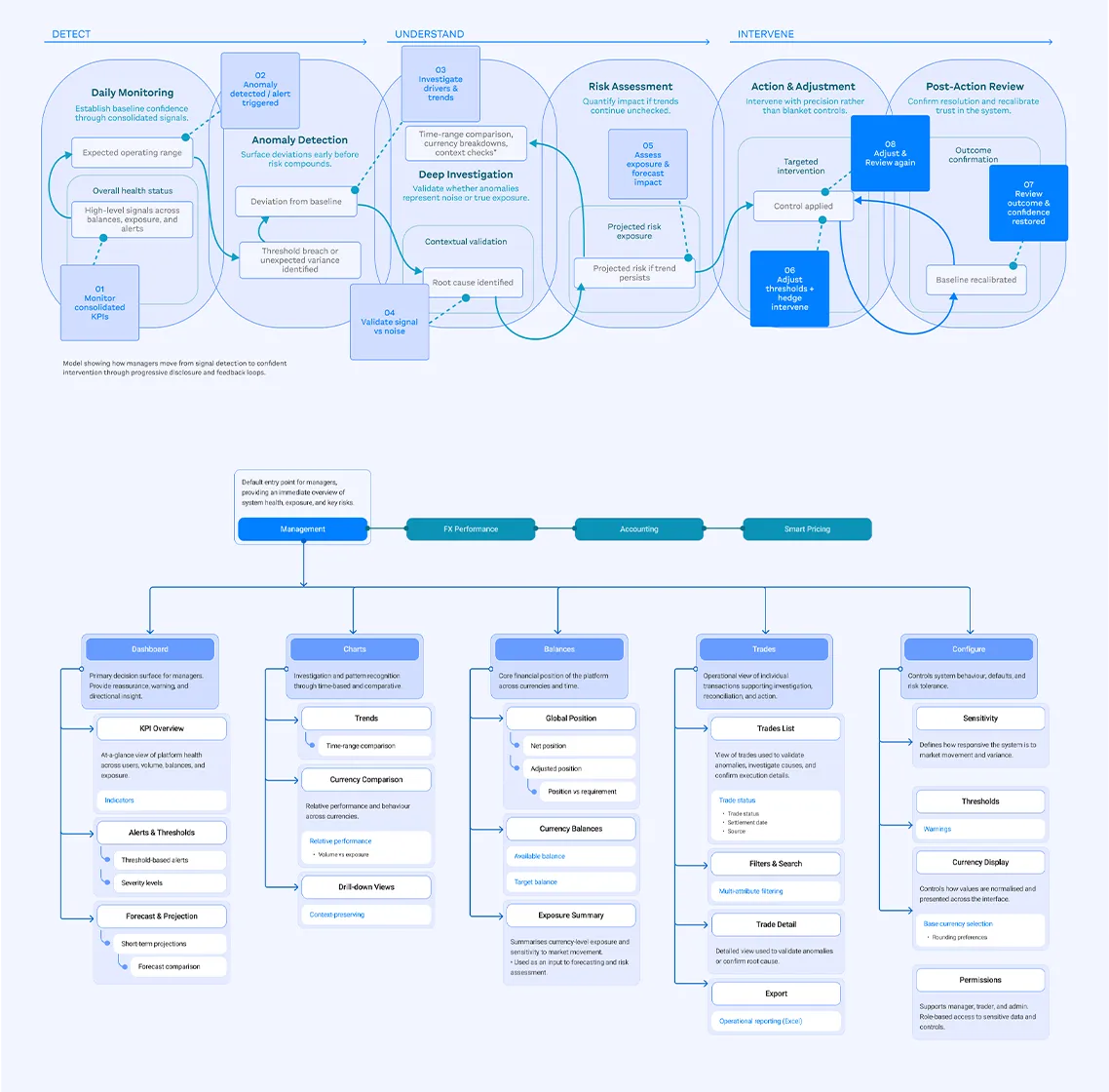
From signal → trend → confidence
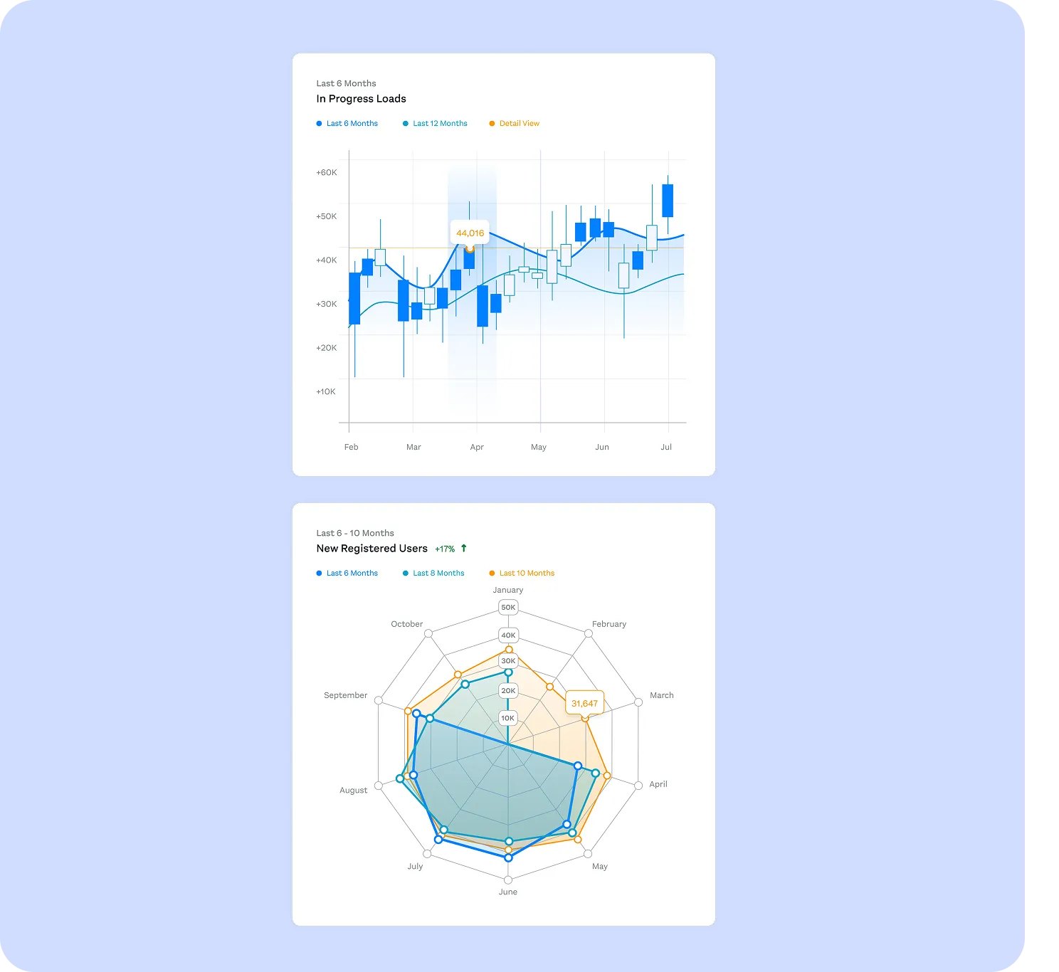
Charts provided teams with data visualisation as a sense-checking space to interrogate performance and validate signals surfaced at dashboard level.
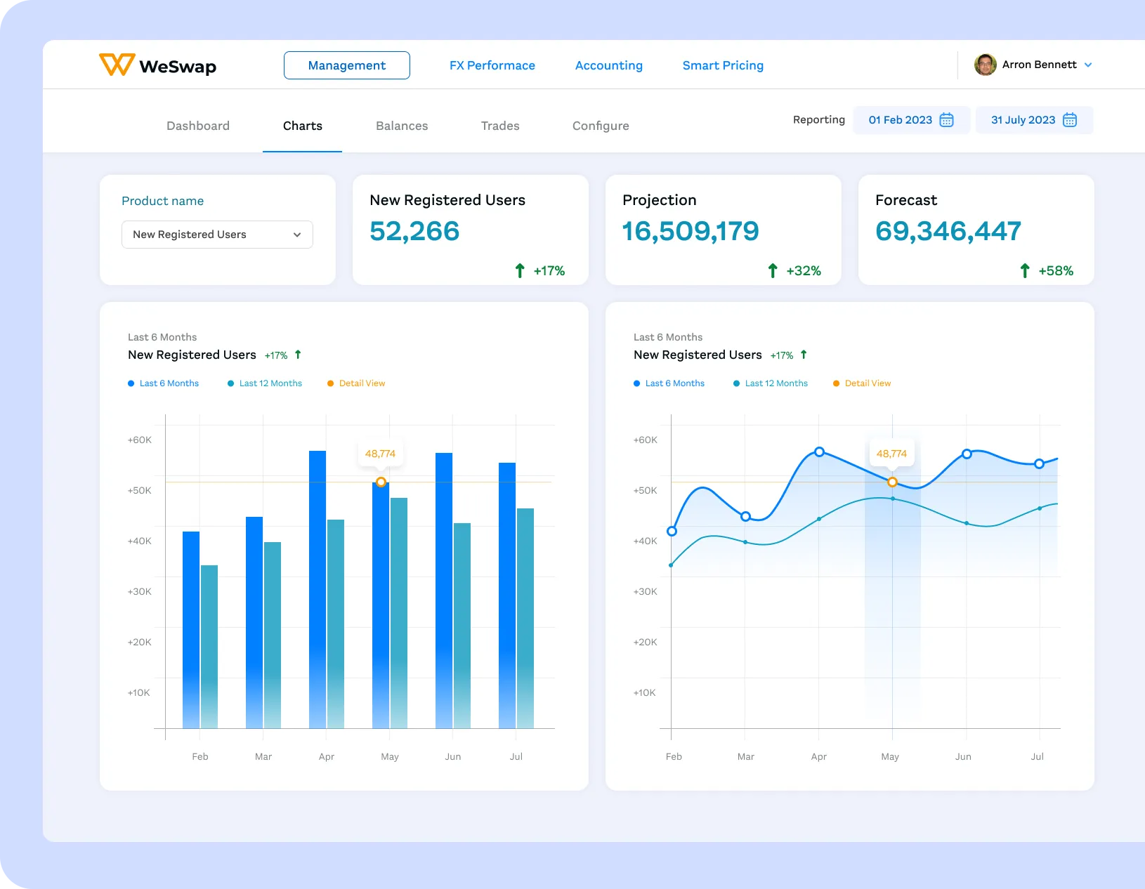
Charts provided teams with data visualisation as a sense-checking space to see the performance and signals surfaced at dashboard level.
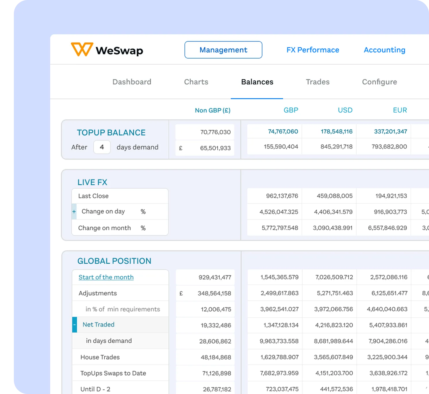
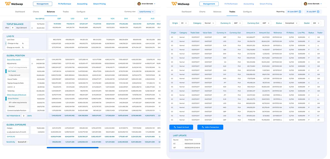
Balances consolidated currency positions, live rates, and liquidity into a single, comparable view to show exposure without relying on spreadsheets.
Outcome
The new operational dashboard gave a clearer, more confident way to manage platform health and performance.
The redesign brought fragmented performance, exposure, and risk data into a single, coherent system, helping teams move faster and make decisions with greater confidence.